House & Co

Who is the client?
House & Co are a successful Estate and Lettings agency in Bristol, with a novel approach for their industry - their branches are interlinked, so that their clients can view properties from all over Bristol from any location.
What was the brief?
The brief started as a simple redesign of House & Co's 'For Sale' and 'To Let' signs to make them attractive to families, but expanded to encompass their branch design, leaflet campaigns and internal communications, too.
What was the solution?
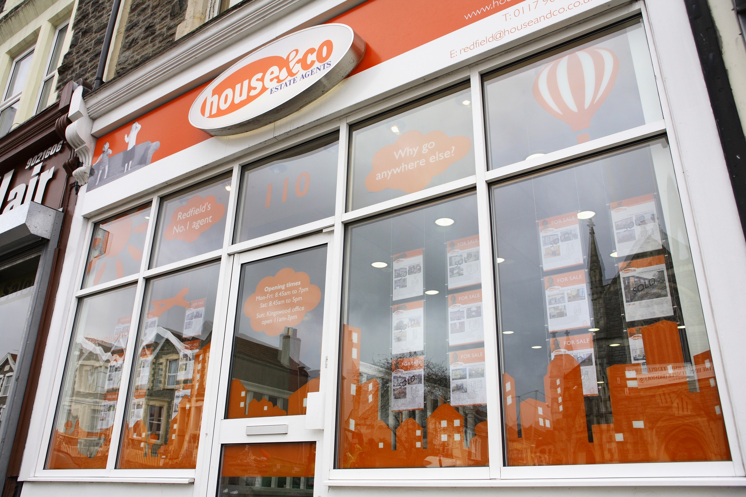
We first set a clear demarcation between the two sides of the business by taking one colour from their logo for each - orange for Property Sales and blue for Lettings, to make it easier for their customers to identify which type of property they were viewing.
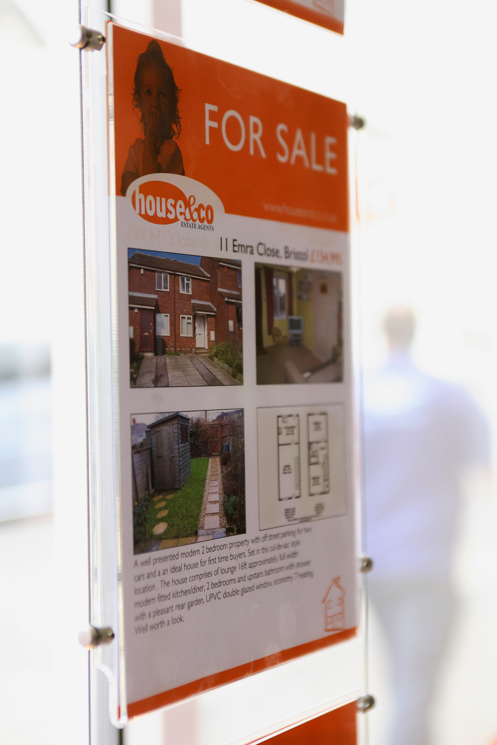
A family-friendly feel was brought to the 'For Sale' and 'To Let' signs by using an image of a thoughtful-looking little girl on the former and an eye-catching rubber duck on the latter, with a fun-looking Bristol cityscape uniting both sides of the brand. Leaflet campaigns, letterheads and property sheets used variations on this theme by using items such as a mug of coffee and some biscuits, or a welcome mat, to continue the homely feel.
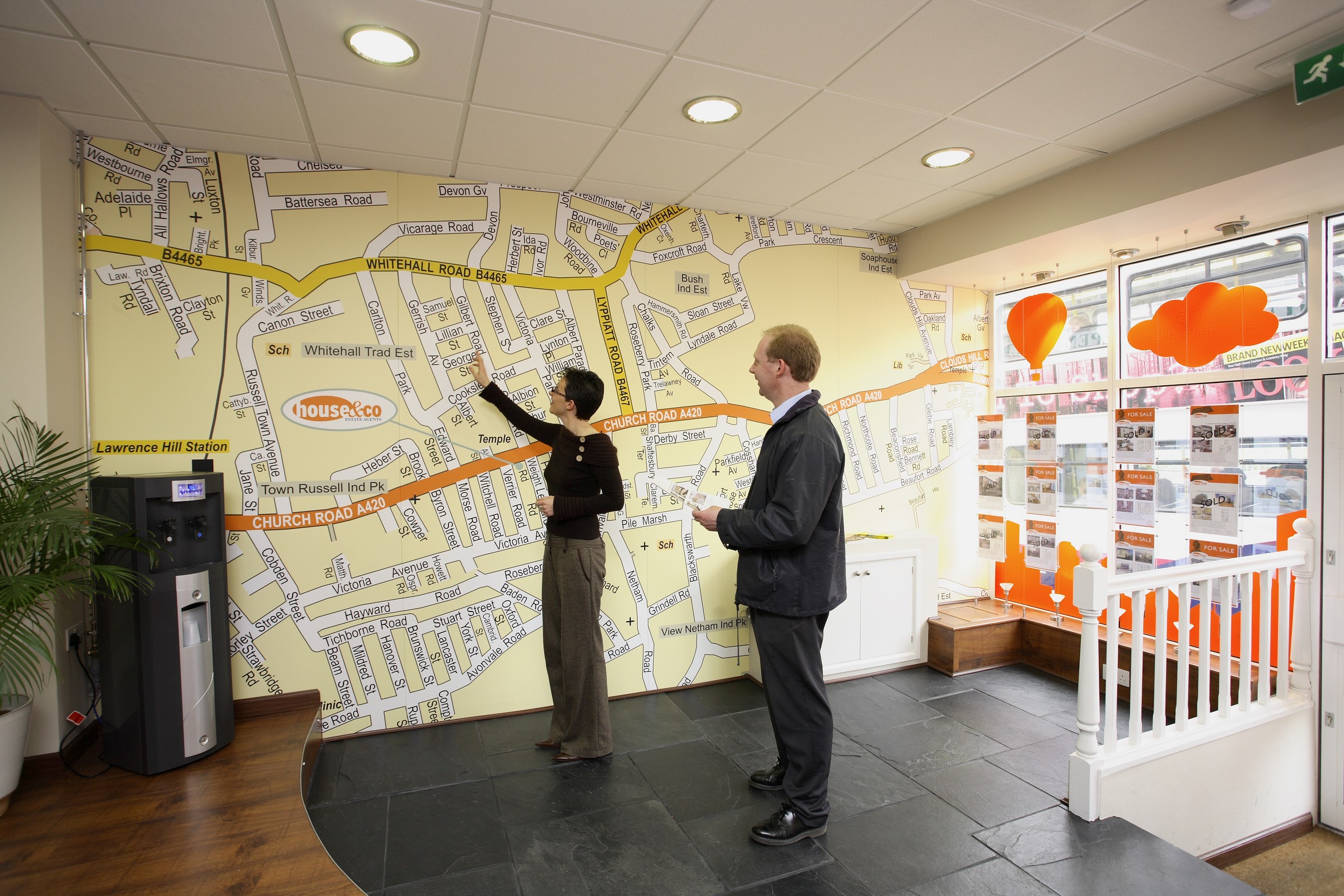
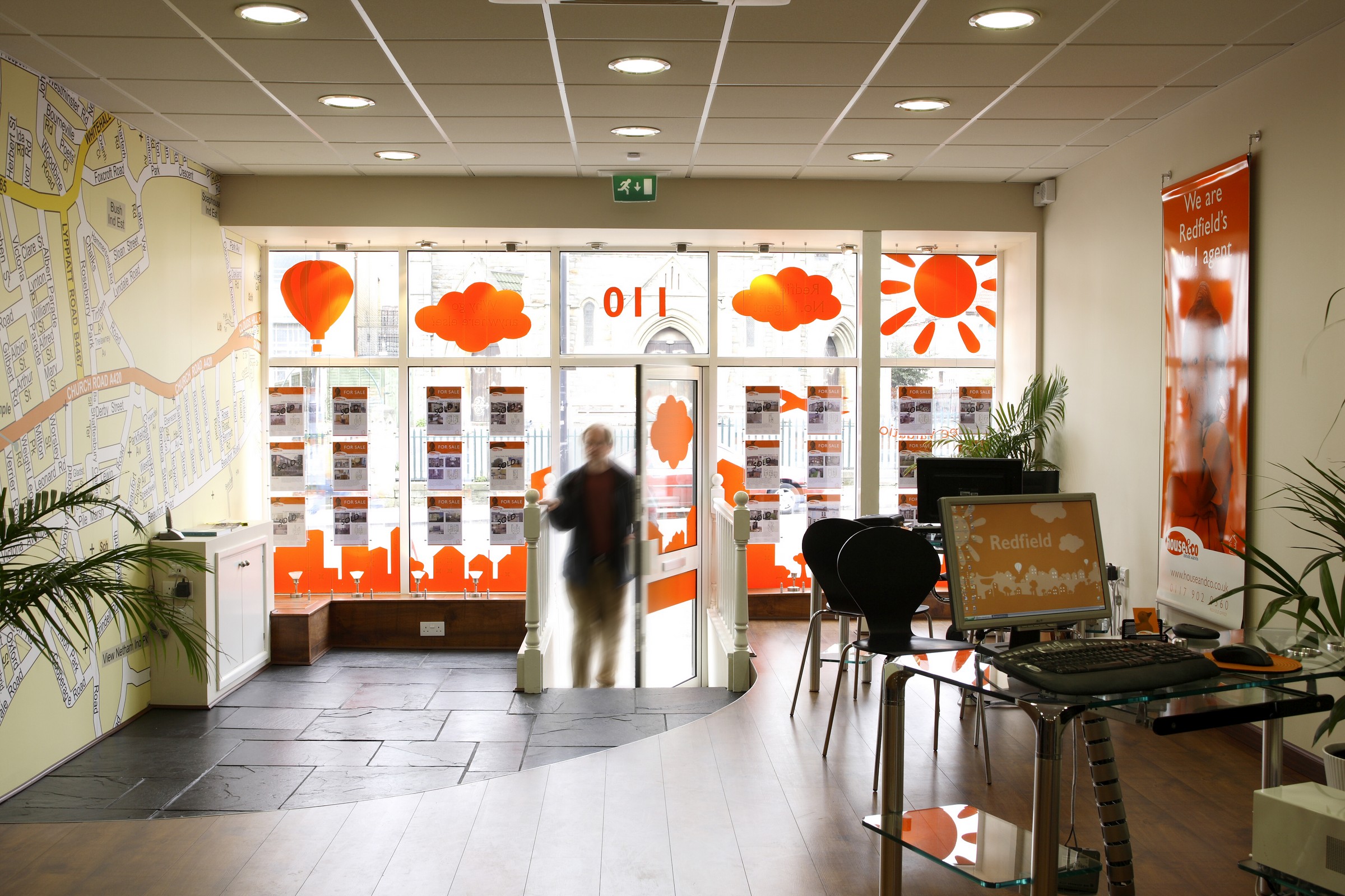
After talking to staff, we realised that it would be useful to have a large local map handy on a daily basis, with which to discuss the area with customers. So we expanded the brand to the walls - quite literally - with digital wallpaper. A map of the surrounding area covered one wall, with the back wall reflecting the brand colours and local identity. This was further enhanced with bright orange, screen-printed wall hangings, branded computer screen wallpaper and attractive branded window vinyl to draw customers in.
The final element of the rebrand was the House & Co van, which serviced both sides of the business. So both sides of the van were utilised - one side having an orange cityscape for Property Sales and the other a blue cityscape for Lettings. The result was fantastically eyecatching and can be viewed in a separate case study.